Feature Description
A Grid Image Widget, sometimes referred to as a hover widget as when hovered over, additional content will appear, allows you to create a widget with an image that links internally or externally of your Elevate site. Grid Image widgets can include multiple buttons, as well as additional text that will appear when a user hovers over it.

Example
- Navigate to Content Management > Pages and either create the new page you would like the widget to live on or click on the button to “Edit” an existing page.
- Click on “Add new widget to main page content.” Your pages are divided into 12 columns. So be sure you “size” your widget accordingly. If you want the widget to span across the entire page, give the “size” field a value of 12. If you want the widget to span across half of your page, give the “size” field a value of 6. Enter the number of rows that you want your widget to use. Keep in mind, the widget will auto-size the number of rows based on the content you have within it.
- Enter a name for your widget and check the boxes to determine if you want to display the name on your page, give it a border, or hide it from mobile or desktop devices.
Choose “Grid Image” for the widget type. On the Grid Type line, select Category, Product Type, Page Link, or Discussion, depending on your purpose for this widget.
If you are selecting Category or Product Type, you must first create a page for the Category or Product Type. If you are selecting Discussion, you must first create the discussion.
For the purpose of this tutorial, we will be following the set-up for a Page Link.
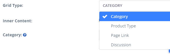
Fig. 1 - Grid Type
- If you would like additional text to display to the end-user when they hover over the widget, click the checkbox on the "Inner Content" area and type in the content you would like to display.
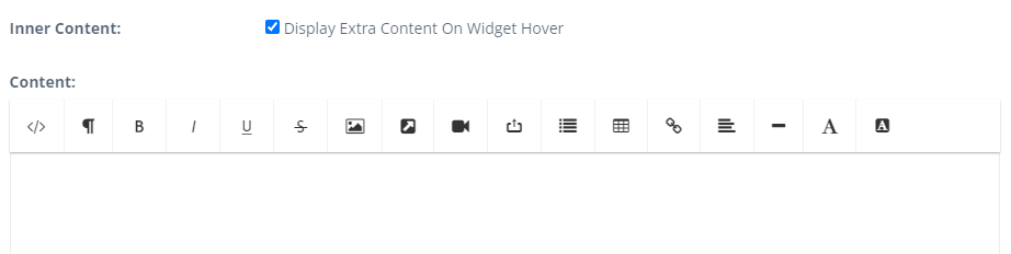
Fig. 2 - Inner Content
- If your Grid Image widget will be linking to a page on your Elevate site, select the existing page from the "Page Link" dropdown menu. If you would like the Grid Image to link to a page externally of your site, do not select any pages from the Page Link dropdown. Instead, enter the URL that should be linked in the URL field found in the Buttons section of the widget.

Fig. 3 - Button Link
- Enter the image you would like to use for the widget by clicking on the "Upload file" option within the Upload area, or select an existing image but clicking on "Choose an existing file."
- In the Buttons section, input what you would like the text of the button to display. By default, the text of the button will read, “More Info.” In this section, you also have the ability to select whether the link will open in a new window or tab, as well as add additional buttons.
- Once you have entered the information you wish to click “Save.” This will return you to the page editor for the page you are editing. Click “Save and Stay” to save your changes.
Was this article helpful?
That’s Great!
Thank you for your feedback
Sorry! We couldn't be helpful
Thank you for your feedback
Feedback sent
We appreciate your effort and will try to fix the article